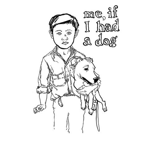
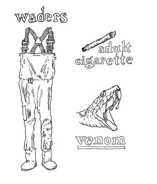
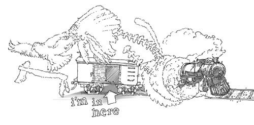
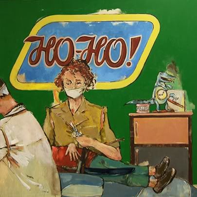
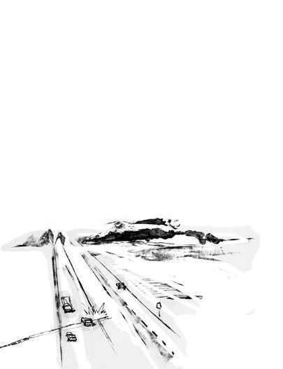
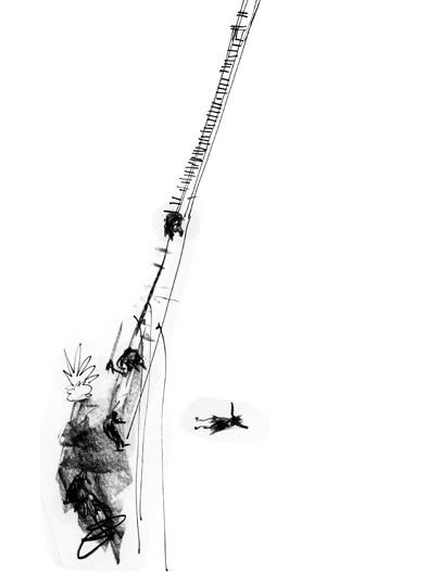
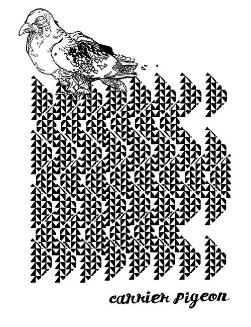
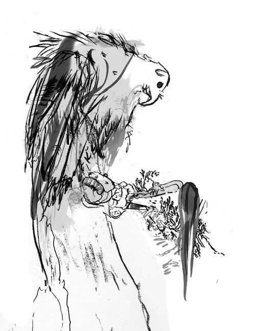
For the cover of Carrier Pigeon issue no. 2, ten artists were commissioned for cover images to be screen-printed onto 100 of the 1,000 copies. Mine, below. The only restriction of the assignment was that the carrier pigeon be represented.
I like birds. And the properties of quartz. And prisms. And hieroglyphics. And ancient things and other things that aren't represented in this image at all. Paper and scruff.
12.04.2010
10.30.2010
10.27.2010
Revisiting Johnny
Click on this image to see a larger version. |
I like it, after all.
I focused on the religious aspects of the story because I abhor a bruisingly political undercurrent and because I'm, well, obsessed with personal spirituality. But that's neither here nor there. These images represent the first time I ever digitally colored on top of my own painted images, and it was quite a nice feeling.
10.25.2010
Flux Family Feud
On November 15, Flux Theatre Ensemble is hosting a benefit on the rooftop of the Maritime Hotel. I redrew and tweaked a classic Family Feud logo in support of the Family Feud event. Come by to watch New York theatre artists compete to answer trivia about their own profession.
Click here to purchase raffle tickets for prizes that include paid background work on "Law and Order: SVU" or a Jim Carrey film. If that doesn't strike your fancy, there's also jewelry hand-made by Ryan Andes, two free seven-week seasons with NYC Social Sports Club and a signed copy of the Pulitzer Prize-winning play Ruined by Lynn Nottage.
Proceeds support Flux's fourth season, themed "Don't Look Away."
10.19.2010
The Quiet Place
In addressing a short story by Benedict Fleming about a small boy who stumbles upon one potential dangerous situation after another in a bayou town of eastern Texas, I thought about visually generating the ghosts and ancestors swimming around in his prose, and I kind of wanted to. I wanted to put that bit of flair into play. But, upon further scrutiny of the words and structure, it's the quiet that I liked most, the mundane interjections of daily life in which the boy is absorbed to distraction.
So I bit down my theatrical side and drew what I hope are illustrations from a quiet place and a reflected point of view.
It was a little hard to leave out color for such a soupy environment, but these are sketches of memories that probably won't stay in the character's mind, so I don't want them to leave too indelible an impression on the page, either.
10.04.2010
Simple inspiration, outdoors and nearby.
I'd lived just a couple of subway stops from the Brooklyn Botanical Garden for more than three months before walking through the doors. Hosting my mom was the perfect opportunity to take a stroll and collect a pocketful of buckeyes, which are cool and soft right out of the shell. You may know them as conkers.
The nicest thing about this kind of afternoon is being surrounded by small, dappled, shifting details. I've gone back to my sketchbook inspired by the movement achieved by layers of color.
And then there are the colors I'd forgotten exist:
And, just that quickly, I'm newly excited about capturing outdoor settings on the page. And have, on a whim, bought a five-pound book on watercoloring techniques.
9.10.2010
Alphabet manuscript in progress, for fun.
A is for animals with nothing to say
B is for the baseball that's heading your way
C is for coats that don't fit anyone
D is for doctors who ruin the fun
E is for eggs growing legs in your dreams
F is for fingerprints you can’t help but leave
G is for growing an inch in your sleep
H is for holes, impossibly deep
I is for inching across the floorboards
J is for jumps that don't know what’s in store
K is for kissing a frog, just in case
L is for lurking at windows all day
M is for mussels slipped into the stew
N is for night-lights that go out on you
O is for one, one, one, only one eye!
P is for pictures you see in the sky
Q is for questions from someone much taller
R is for raising your voice to a holler
S is for spying while creeping about
T is for tattlers who point it all out
U is for uniforms on their first day
V is for a visitor who won't go away
W is for the wild in things seen everywhere
X is for X-rays to show what’s in there
Y is for the yowling of beasts running free
Z is for the zoo, where you ought to be.
Friendly reminder: Copyright© 2010 Kristy Caldwell
9.08.2010
Wendy defangs Peter
The first painting I ever wanted to attempt on a child-centric theme was to be inspired by J.M. Barrie's original Peter Pan. The effect of reading the book, however, was to sweep clean the space in my head that had been condescendingly roped off for "child-appropriate amusements". Childhood is dark, and the best part of Barrie's vision is his casual acceptance of this: “Off we skip like the most heartless things in the world, which is what children are, but so attractive; and we have an entirely selfish time, and then when we have need of special attention we nobly return for it, confident that we shall be rewarded instead of smacked.”
I imagined a reunion in which Wendy, now a dental assistant, takes care of a pointed tooth compromised by, oh, decades of sweets or maybe a glancing dagger. By this act Wendy is essentially defanging Peter, and the scenario becomes—whether I like it or not—a metaphor for his perpetual prepubescence in the face of her adult experience. You can't stop the moving train of subtext.
9.04.2010
Off-topic one-offs
9.02.2010
Remnants of an abandoned story
Every half-decent idea is destined for a second chance via indefinite archiving on my external hard drive, where this project currently resides. During the couple of days that I was hot for the possibility of this book I drew like a madman. I can't manage a spontaneous line when tracing pencil, so I always dive right into inking. Also, having to follow a path that barely even exists in my brain keeps me focused.
8.31.2010
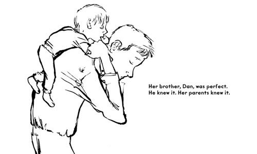
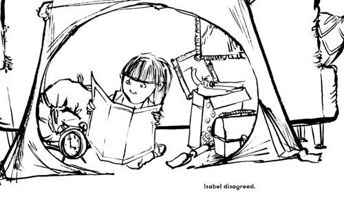
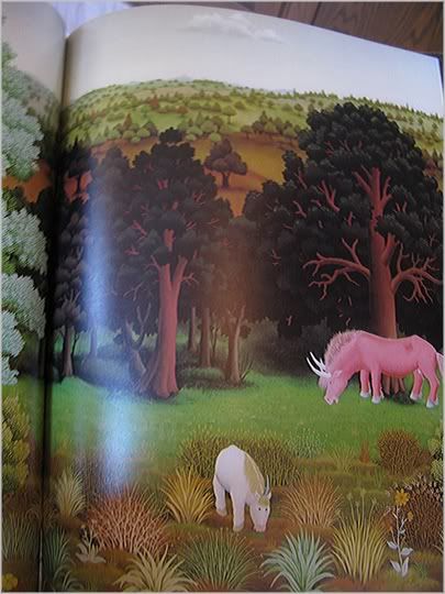
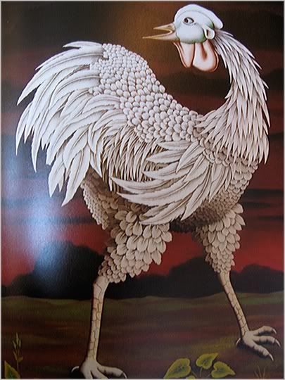
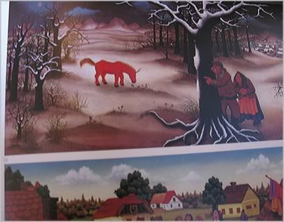
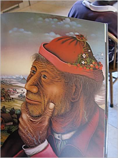
Naive Painters of Yugoslavia
I found this book in the Boston Public Library and it has since jumped right to the top of my wish list. There are books you feel you should have, and then there are books you need, badly, for no reason at all.
The individual techniques represented within are impressively slippery and slick, but it's an overlapping effect of visual magic that makes my mind wander in satisfying ways.
8.29.2010
The Wrong Color, page 10 process
Eventually I suppose I'll settle down enough to throw away all the files that aren't absolutely essential to the continued viability of my thesis project, which I finished (for the moment) in April of 2010. For now, my first full-length, full-color picture book attempt is so heavily backed up that I could recreate most stages of most pages. And that's what I'm doing in this post: describing the laborious, sometimes blind and stumbling thoughts that accompanied me through eight months and into a page I actually like.
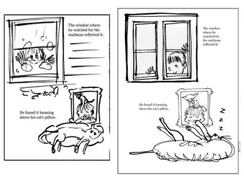
Here, a thumbnail and a first attempt at a book dummy, where the thumbnail is expanded. On this page Warden is noticing that the color he dislikes is showing up not only in common spaces of the house, but also in his personal spaces.
These next versions come from the next two book dummies. I constantly updated pages, usually for clarification of content. Technical rendering can be finessed at a later time, once the story is solid and flows like it should. By this point I'd realized that every instance described didn't have to be shown, and so I'd done away with two-part vignette pages.
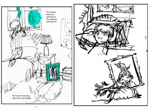
Now things became more highly rendered. It was good to test how I wanted pages to eventually look, but I still ended up drastically re-drawing several more times.
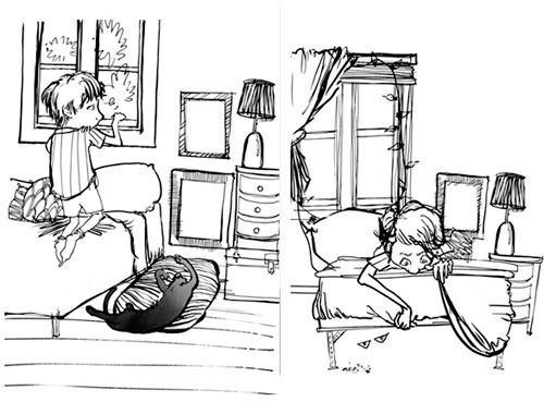
I began to want more solidity to this page. The page hadn't worked to my liking yet, and I was determined to have the scene facing straight-on. My instincts usually lead me to overburden a page, rip it up, make the same mistake again, and then wise up and strip it back down to its most important elements. This is when, for me, things take real shape. I haven't found a shortcut to this completely arduous approach.
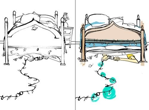
Last comes shifting, tightening and coloring. The shifting comes courtesy of Photoshop, as do the light gradients of color. Other pieces of color were inked separately and then scanned in. The texture was scanned and manipulated separately, as well.
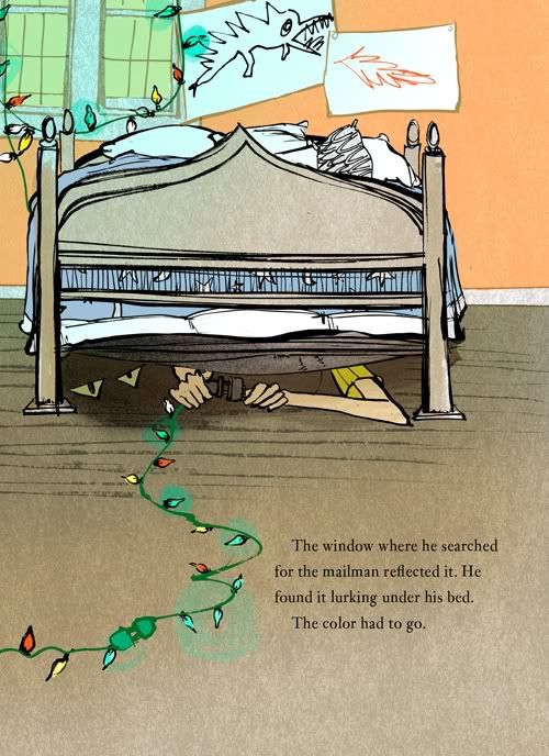
And, so far, that's how this process looks for me. My goal is to to cut out half the steps in future attempts by being better able to see the whole and nudge out hiccups in tone.
8.28.2010
The Wrong Color on Little Chimp Society
I've ever so slowly begun taking steps to promote my work, like a sane, normal person would have done long ago.
Here is a light tip to The Wrong Color accepted by Little Chimp Society, the Illustration News Portal. It's probably my fault that Warden's name is wrong, so I shrug it off and finish my second cup of coffee, oddly better than the first.
Good day to you all.
Here is a light tip to The Wrong Color accepted by Little Chimp Society, the Illustration News Portal. It's probably my fault that Warden's name is wrong, so I shrug it off and finish my second cup of coffee, oddly better than the first.
Good day to you all.
8.27.2010
Predecessors and tipped-in engravings
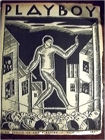
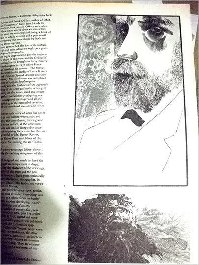
On Wednesday night the staff of Carrier Pigeon illustrated literary journal were lucky enough to be invited to the home of Stephen Fredericks, founder of The New York Society of Etchers and all-around printed matter scholar, for a viewing from his private collection. Though my camera was a sad, sad spare, I did what I could to capture a glimpse of the beauties he brought out. Journals from between 1850 and 1920 featuring the rock-star printmakers of the time were stitched together so that the prints contained inside could be torn out and appreciated separately. While one of these removed etchings, photogravures or engravings may cost more than $1,000 on eBay, an intact copy of the magazine can be found, if you're lucky, for under $100. But you have to be pretty dedicated to find these.
Item 1: Playboy, not the one you're familiar with, although typography did carry over. "A portfolio of art & satire." It's hard to see the date in the right-hand corner, but I think it says 1881.
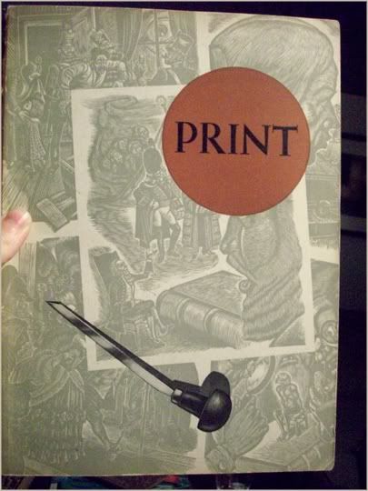
Item 2: I think this is from Print, not the one you're familiar with.
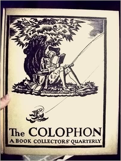
Item 3: The Colophon, a Book Collectors' Quarterly. Sigh. This edition is filled with personal essays that could have been written yesterday and are accompanied, blog-style, by process sketches detailing, for example, the malaise of the book illustrator's life. Sigh. There's really nothing dated about it.
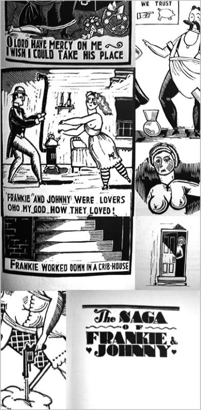
Item 4 (cue up the dirty brass band): a patching together of The Saga of Frankie and Johnny, "beautifully engraved by John Held Jr," an artist-originated book about a couple who "loved their life away," like a saloon, like Modigliani, like a broken Russian farce.
So many thanks go out to Stephen Fredericks for a great night. Learn more about his personal work, press work and the Art of Democracy here.
Carrier Pigeon will soon be up and running online.
Item 1: Playboy, not the one you're familiar with, although typography did carry over. "A portfolio of art & satire." It's hard to see the date in the right-hand corner, but I think it says 1881.
Item 2: I think this is from Print, not the one you're familiar with.
Item 3: The Colophon, a Book Collectors' Quarterly. Sigh. This edition is filled with personal essays that could have been written yesterday and are accompanied, blog-style, by process sketches detailing, for example, the malaise of the book illustrator's life. Sigh. There's really nothing dated about it.
Item 4 (cue up the dirty brass band): a patching together of The Saga of Frankie and Johnny, "beautifully engraved by John Held Jr," an artist-originated book about a couple who "loved their life away," like a saloon, like Modigliani, like a broken Russian farce.
So many thanks go out to Stephen Fredericks for a great night. Learn more about his personal work, press work and the Art of Democracy here.
Carrier Pigeon will soon be up and running online.
8.25.2010
The Wrong Color character sketches
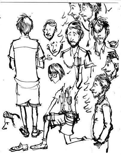
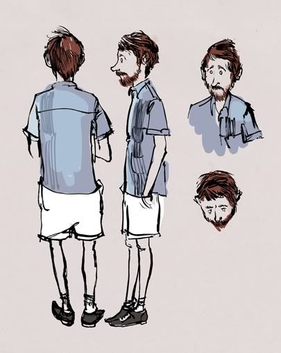
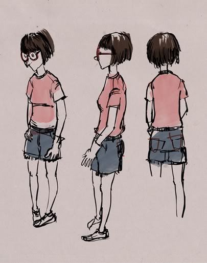
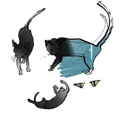
I'd been meaning for a while to delve into the process of making my thesis book The Wrong Color, but mid-thesis is not always the best time to break for gregarious online schmoozing. Now seems like a great time for it, so here are a sampling of initial character sketches I scribbled with a brush pen and then colored with markers, spray paint and Photoshop tools. At the time I thought these took shape so quickly that they didn't count: I could do better. Amazingly (predictably), it took twenty times as long to replicate these on the page when it mattered. I kept them to the left of my drafting table all year. Only the main character, Warden, continued to shift right up to the moment I began final pages.
Dad
Mom
cat (unnamed)
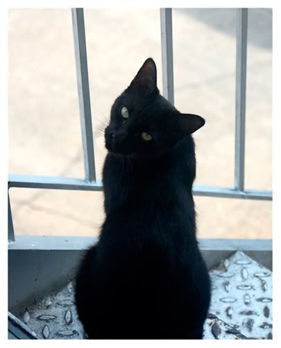
(cat inspiration: Sascha, a boy's name for a girl cat, taken from the duck character in Peter and the Wolf. I really mis-named her, now that I think about it. She was a complete terror.)
Dad
Mom
cat (unnamed)
(cat inspiration: Sascha, a boy's name for a girl cat, taken from the duck character in Peter and the Wolf. I really mis-named her, now that I think about it. She was a complete terror.)
8.21.2010
Ideas from the city
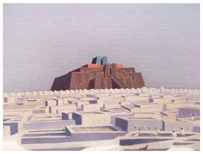
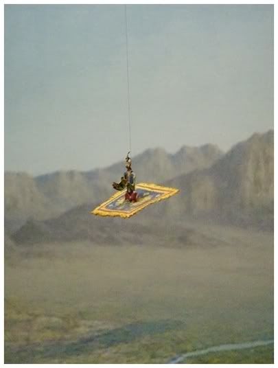
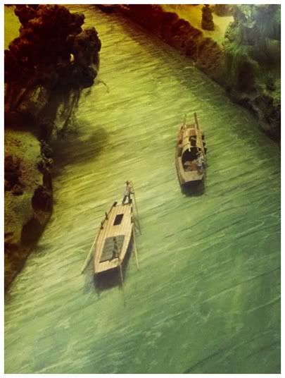
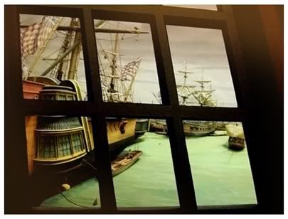
Once you block out the static of hundreds of children and their day-sitters, there are interesting sites to be seen deep in the world of early peoples, threshing evolution, iron-based tools and, of course, masks in the American Museum of Natural History. But really, all the good stuff, the stuff I like, is buried in the details of dioramas.
8.20.2010
Swoop
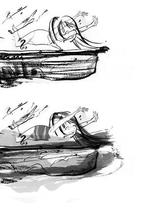
For issue 2 of Carrier Pigeon I illustrated a story by Christopher Stanton, titled "Swoop," in which a young girl is snatched by a fairly gross, huge bird right in front of her teenaged babysitter. The issue will be available in the winter of 2010. The website for the journal is on its way to being fully operational, and resides at carrierpigeonmag.com.
I drew these with compressed charcoal and then filled them in digitally with scanned washes of walnut ink. If you were to break the whole process down into these two steps, the results would look like this:
And here's the girl being carried away. Forever? It's not my story to tell.
For issue three I plan something busier and more colorful. All I can say right now about the new collaboration is it's set in the bayou. I intrinsically approve of this, of course, being from Louisiana. Everything else should fall into place.
8.18.2010
Hints of Robert McCloskey
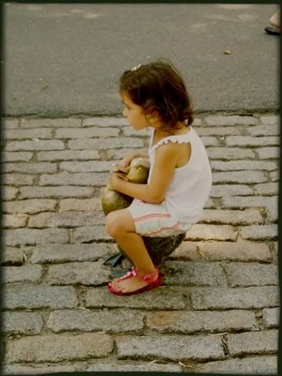
It took me two days in Boston to realize the frequency with which I was spying copies of Make Way for Duckings wasn't a coincidence. In fact, I was standing right in the middle of the city's oldest public garden before it hit me. The following are photos of the ducklings' original home in Boston Common.
In the distance is a small, duck-populated island with a ramp for their convenience.
It's only natural.
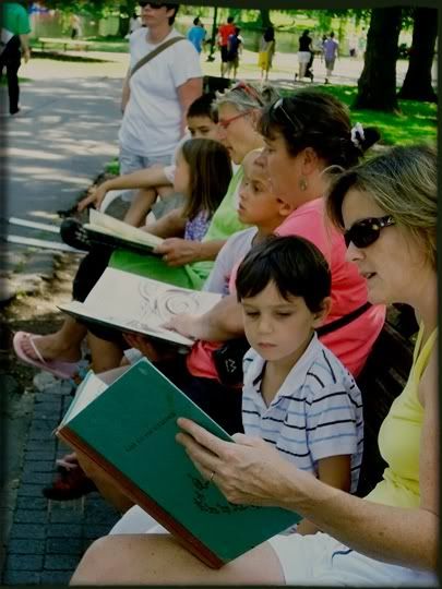
Bronze sculptures of McCloskey's duck family are in view of the line of benches studding the walkway.
It blew my mind that people were purchasing the book just to read it to their children in the environment of its inception.
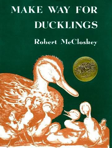
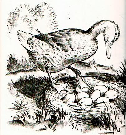
And for those of you sadly unfamiliar with the official children's book of Massachusetts, here are a couple of images to jog your memory. Because you've surely seen it lining the dusty shelves of your local library, although never the dusty piles of book fairs (because no one throws this one out).
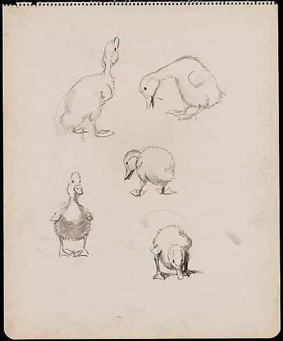
And here's an extra sketch for the "classic children's book" obsessed.
I know, I know: they're just ducks. But they're extremely well-done, pleasing ducks. Just wait 'til you see the policeman who helps them cross the street. Sigh.
4.24.2010
Walter's Ladder
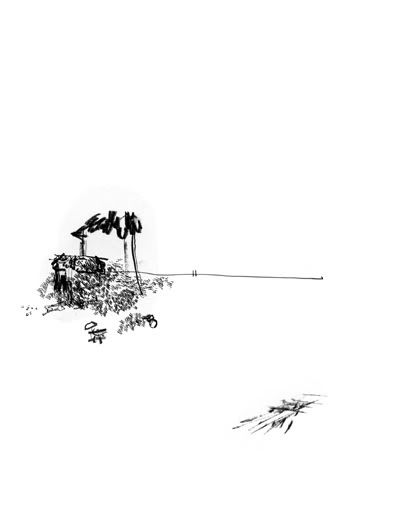
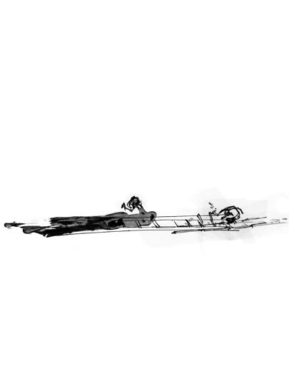
I recently made six illustrations to complement Brian Thompson's short story "Walter's Ladder," which may soon be adapted to a short film. His story is so specific in its atmosphere that it seemed rude to chance carving hard lines into the characters, so I kept things loose and simple. Two of the resultant images will soon be on view in the web gallery for American Illustration 29. The full-sized images and story will be available in the first issue of Carrier Pigeon in October.
Subscribe to:
Posts (Atom)